The Grammar of the Silent Film.
Between 1895 and 1929, filmmakers with no usable recorded dialogue built a complete visual language — gesture, intertitle, editorial rhythm, optical punctuation, chromatic tone — that modern wordless cinema still quotes fluently. This is the grammar, fully cited.
A scholarship piece for the production office of The Queen's Fare — verified against primary sources, July 2026.
I. A Prefatory Note on Language Without Words
In October 1927, Warner Bros. released The Jazz Singer. Its star, Al Jolson, spoke roughly two minutes of improvised dialogue and sang six songs. The trade press reported the talking sequences as a novelty attached to a largely silent film. Within eighteen months, the Hollywood studios had converted almost entirely to sound production. By 1930, the silent feature was commercially extinct.
What ended was not a primitive form of cinema waiting to be completed by audio. What ended was an art form that had spent thirty-five years solving, in purely visual terms, every problem that storytelling requires: establishing a character's interiority, marking the passage of time, punctuating the transition between scenes, controlling the emotional temperature of a sequence, and creating meaning not from any single image but from the relationship between images. The practitioners who developed those solutions — D. W. Griffith, Lois Weber, Lev Kuleshov, F. W. Murnau, Buster Keaton, Lillian Gish, Fritz Lang — were not working around an absence. They were working within a constraint that forced invention.
The grammar those inventors built did not disappear when talkies arrived. It went underground. Directors who understood it kept using it. Directors who did not understand it sometimes stumbled into it by intuition. And periodically, filmmakers have surfaced who understood it so well they chose to make films that used almost no spoken language at all — not from nostalgia, but because the problem they were solving demanded the same tools.
This essay describes that grammar — its specific technical components, their historical origins, the debates that shaped them, and the modern films that demonstrate their continued validity. It is written for a production office working on a short-form wordless narrative series, because understanding a grammar before you write in it is not pedantry. It is craft.
II. The Actor's Body: Gesture, Pantomime, and the Great Debate
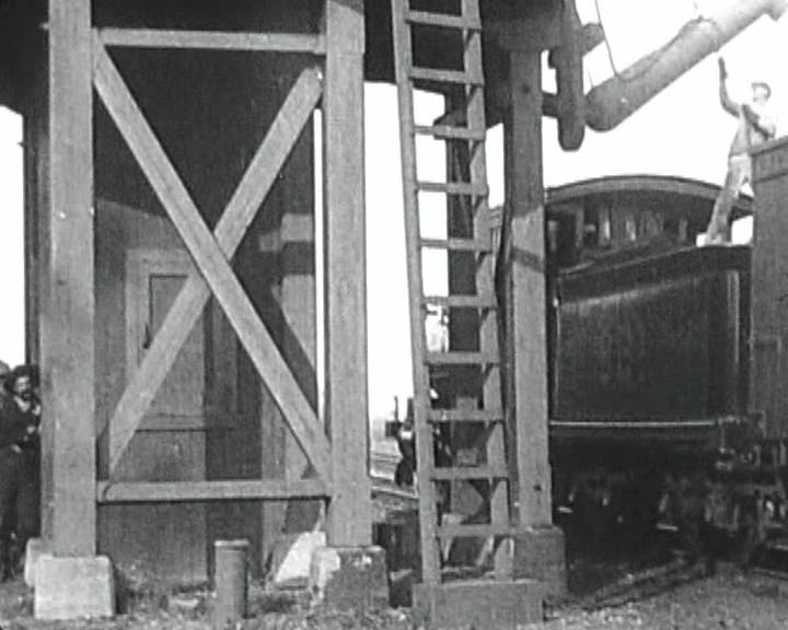
The first problem silent film faced was how actors should use their bodies. The answer was not obvious, and the debate it generated lasted more than two decades. Understanding what was actually at stake clarifies why the resolution of that debate was one of the medium's most important technical achievements.
The Stage Inheritance
The first films were shot in front of fixed cameras at distances roughly equivalent to a theater's front orchestra section. The audience's relationship to the actor was, in spatial terms, close to the relationship established by the stage. It followed — to producers in the 1890s and 1900s — that actors trained for the stage were the natural performers for this new medium. Stage acting in the melodramatic tradition of the late nineteenth century was large: facial expression amplified for the back row, gesture emphatic enough to read across a footlit proscenium sixty feet from the last seat. Pantomime, in this tradition, was not a pejorative. It was a specific, codified vocabulary of physical expression developed over centuries of popular entertainment — arms wide for welcome, clutched hands for supplication, a head thrown back for anguish that could be read from the gallery.
The problem emerged when the camera moved closer. Beginning around 1908, directors discovered that the camera could be repositioned between shots — that a scene could be covered from multiple distances, and that those different distances could be intercut in the editing room to create a continuous sequence. The medium shot could give way to the close-up. When it did, the actor's face filled the frame at a scale no theater audience had ever seen a human face: every micro-expression legible, every held breath perceptible, every twitch of the lid carrying weight. At that scale, the pantomime vocabulary became grotesque. Movements calibrated for the back row became convulsions.
The Two Schools
By 1914, American audiences had begun making known their preference for greater naturalism on screen. Two schools formed, and the debate between them was often explicitly nationalized. In 1915, the American poet and film critic Vachel Lindsay argued in his The Art of the Moving Picture that European stage acting was fundamentally unsuited to cinema — that the theatrical tradition, with its conventions of projection and gesture, produced performances that read on screen as posturing rather than feeling. This critique would hold sway for decades, with European acting frequently characterized as mannered and stagey against a supposedly more subtle American norm.
The most cited case study was Sarah Bernhardt. The French actress — the most celebrated stage performer of the late nineteenth century — made relatively few film appearances, and those she made were received with divided critical opinion: spectacular in their theatrical energy, but calibrated for a scale the camera could not accommodate. Against Bernhardt, film historians and contemporary critics alike positioned Lillian Gish. Gish had begun as a child performer in stage melodramas, but her fame derived entirely from her work with D. W. Griffith, beginning in 1912. Gish developed a performance style of exceptional restraint — what Victoria Duckett, in her scholarly analysis of silent screen acting, identifies as the internalization of emotion rather than its external projection. By 1927, Vanity Fair was calling Gish "the First Lady of the Screen," a title that ratified the naturalistic school's victory.
Director Marshall Neilan put the industry's frustration with stage imports bluntly in 1917: "The sooner the stage people who have come into pictures get out, the better for the pictures." Neilan's hostility was overstated — many stage actors adapted successfully — but his complaint identified a real structural problem. The stage trained performers to project outward. The close-up required them to contain inward.
Resolution: The Grammar of Restraint
The solution that emerged between roughly 1910 and 1920 was not the abolition of pantomime but its refinement and stratification. Silent film performance developed a tiered register: in long shot and medium shot, gesture retained much of its theatrical legibility; in close-up, expression contracted to the microphone range — the held gaze, the parted lip, the slight compression of the brow that could carry more meaning than any extended physical gesture. The actors who mastered this dual register — Gish, Keaton, Chaplin, Emil Jannings, Lon Chaney — were working in a genuinely new performative mode, one the stage had not prepared them for and the sound era would partially obscure. When voice arrived to carry the weight that expression had borne, the close-up could relax. Some of what was lost in that relaxation has never been fully recovered.
III. The Intertitle: A Punctuation Mark in Two Registers
Silent film was never truly silent — theaters provided live musical accompaniment as a matter of standard exhibition practice — but it was, by definition, verbally mute. Intertitles were the medium's solution to the problem of language: a text card inserted into the visual stream to supply what the image could not efficiently carry. Their history is more varied, and their design more artistically intentional, than their reputation as stopgaps suggests.
Origins
The intertitle originated around 1902–1903, with Uncle Tom's Cabin (Edwin S. Porter, Edison Manufacturing Company, 1903) among the earliest films to use them systematically. The first generation of titles were purely expository — summary cards placed before a scene to tell the audience what they were about to see, functioning less like language in a narrative and more like chapter headings in a book. "Scene 4: The Auction Block" was not dialogue; it was navigation.
Dialogue titles — intertitles that represented spoken words within the story — developed somewhat later, becoming prevalent as narratives grew longer and more dependent on character-to-character exchange. By the mid-1910s, the two types had developed distinct conventions: expository intertitles typically occupied more of the frame, used a more formal register, and were placed between scenes; dialogue intertitles were shorter, faster, and placed within scenes to interrupt the visual action as minimally as possible.
Suspense (1913): The Case Against the Title Card
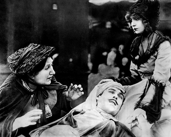
The sharpest early argument for visual storytelling over verbal mediation came from a short film released on July 6, 1913. Suspense, directed by Lois Weber and Phillips Smalley for the Rex Motion Picture Company, is a home-invasion thriller that runs approximately ten minutes and demonstrates — in concentrated form — what the medium could achieve without recourse to verbal explanation.
Weber and Smalley handled the editing themselves, employing cross-cutting and a tight, rhythmic pace to build tension through the alternation of images alone. The film features split-screen shots — a technique almost unprecedented in 1913 — that divide the frame into three simultaneous viewpoints: the wife telephoning for help, the husband rushing home, and the tramp ascending toward the house. The audience reads the spatial and temporal relationships between the three subjects not from a title card explaining them but from the geometric logic of the split frame itself.
Most telling: the tramp character — the source of the film's danger — receives no dialogue intertitle at any point in the film. His intentions and his trajectory are communicated entirely through his physical presence, the composition of the shots he occupies, and the editorial rhythm that connects his progress to the wife's fear. The decision appears deliberate: words would have fixed and delimited what visual pressure could leave open and mobile.
Suspense was selected for preservation in the United States National Film Registry by the Library of Congress in 2020, cited as "culturally, historically, or aesthetically significant." It is one of the clearest early demonstrations that intertitles were a concession, not a necessity — and that the best filmmakers of the era understood this.
The Art-Title Era
Even as the most sophisticated directors were working to minimize intertitle use, the design of the cards themselves was ascending toward an artistic ambition that tells its own story about how seriously the industry took its verbal-visual interface. By the mid-1910s, studios had begun hiring dedicated title writers — recognized as a skilled trade — whose work included not only the composition of the verbal text but its typographic presentation. The plain black card with white block lettering gave way, in many productions, to elaborate decorative borders, textured backgrounds, embedded illustrations, and calligraphic typefaces chosen for their associative weight. A horror film's title card would read differently from a comedy's not only in its words but in its visual context.
This period — roughly 1915 to 1927 — is sometimes called the art-title era. Its peak production is visible in the intertitles of large-scale productions like Griffith's Intolerance (1916), where historical segments used distinct title styles to signal which of the four storylines the audience was entering. The title card had become a graphic system, not merely a verbal one: a way of signaling register, genre, and narrative layer through design choices the audience read semi-consciously.
Fritz Lang's Metropolis (1927) — with its Art Deco lettering, its Bauhaus-influenced geometric framing — pushed the art title to its formal limit. The film's closing intertitle, "The Mediator Between the Head and the Hands Must Be the Heart," was designed as a visual statement as much as a verbal one: its typographic weight and placement made it the visual equivalent of a final chord. The art title was not padding filling the gap where sound should have been. It was a designed object in a designed sequence.
IV. The Tableau and the Cut: Two Philosophies of Cinematic Space
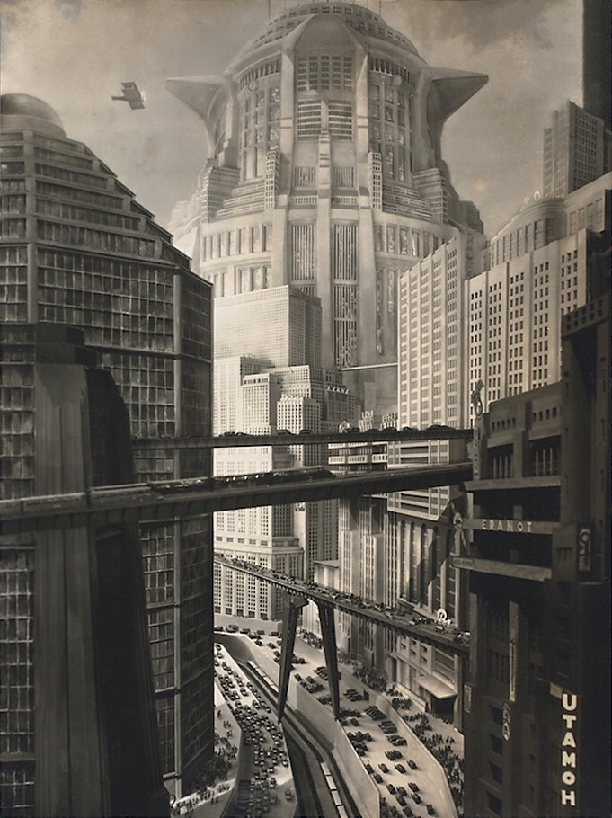
The deepest structural debate in silent film's development was not about acting style or intertitles. It was about the fundamental unit of cinematic meaning: was it the shot, or the cut?
The Tableau Philosophy
Early cinema — dominant through roughly 1907 — operated almost entirely within the tableau philosophy: the camera was fixed in a single position, and the entire dramatic action of a scene was played out within a single uninterrupted shot. The theatrical metaphor was explicit: the frame was a proscenium, the action was a performance within it, and the audience's spatial position relative to the event was fixed throughout. One scene, one shot, one perspective.
This was not a failure of imagination but a defensible aesthetic position. The tableau frame could be extraordinarily rich: long-take compositions that demanded actors to work in precise geometric relationship to each other and to the camera, that allowed the eye to roam within the frame and find meaning in relative position and movement. The "deep staging" of the tableau tradition — multiple planes of action composited into a single image — anticipated techniques that directors like Orson Welles and William Wyler would later deploy as conscious aesthetic choices in the sound era.
But the tableau had limits. It could not shift the audience's spatial position in real time. It could not move from an establishing shot to a close-up within a scene. It could not build tension by accelerating between two simultaneous actions in different spaces. These limitations were not merely technical: they were limitations on what the medium could mean.
D. W. Griffith and the Grammar of Continuity
D. W. Griffith did not invent continuity editing — multiple directors and cameramen were exploring similar techniques simultaneously — but he systematized it, demonstrated it at feature scale, and through the commercial and critical success of his films, made it the dominant grammar of narrative cinema. His Biograph short films of 1908–1913 worked through the problem systematically: cross-cutting between parallel actions, camera movement, close-ups intercutting with medium shots, point-of-view editing that used a character's gaze to motivate the next shot.
The Birth of a Nation (1915) applied this grammar at epic scope — three hours of narrative, battlefield sequences involving hundreds of performers, night photography, continuous cross-cutting between action lines that were geographically remote from each other. The formal achievement was inseparable from the film's deeply racist ideological content, which Griffith used the new grammar to naturalize and make emotionally persuasive: the kinetic energy of continuity editing in the service of a narrative that glorified the Ku Klux Klan. Understanding the technique requires refusing to separate its aesthetic power from its moral deployment.
Intolerance (1916) was Griffith's response to criticism of The Birth of a Nation, and its formal ambition exceeded even its predecessor. The film interweaves four separate historical narratives — ancient Babylon, the crucifixion of Christ, the 1572 St. Bartholomew's Day Massacre in France, and a contemporary American story — in a non-linear structure that required more than fifty transitional edits between the four storylines. For the first time, a feature-length film demonstrated that continuity editing could operate not just within a scene or across a scene but across historical time itself: that an audience could be held in coherent emotional relationship to four simultaneous stories set thousands of years apart, provided the editing rhythm was sustained with sufficient discipline.
The grammar Griffith established — the shot/reverse shot, the establishing/medium/close-up hierarchy, the eye-line match, the cutaway, the parallel edit — became so standard by the late 1910s that subsequent decades of filmmakers absorbed it as invisible common sense rather than as the specific historical invention it was. We call it "invisible editing" today precisely because it succeeded: an audience following a well-cut scene in the continuity tradition is not conscious of the edits, only of the story.
V. The Kuleshov Effect: Meaning Born in the Gap
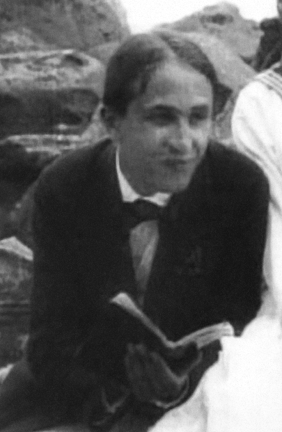
If D. W. Griffith proved that continuity editing could build narrative across space and time, it was the Soviet filmmaker and theorist Lev Kuleshov who proved that editing could build meaning itself — that the cut between two shots could produce in the viewer an emotion that existed in neither shot independently.
The Experiment
In 1921, Kuleshov conducted a series of demonstrations at the Moscow Film School — the first film school in the world, which Kuleshov helped found — that gave the phenomenon its name. The core experiment is simple in description and radical in implication.
Kuleshov took an existing shot of the Russian actor Ivan Mosjoukine — a Tsarist-era matinee idol — displaying a neutral, expressionless face. He then intercut that same shot with three different images: a bowl of soup, a girl lying in a coffin, and a woman reclining on a divan. The assembled sequences were shown to audiences, who reported that Mosjoukine's expression appeared to change in each context — hunger when paired with the soup, grief when paired with the coffin, desire when paired with the woman. The footage of Mosjoukine was identical in each case. The expression the audiences reported seeing did not exist in the shot. It existed in the cut.
This is the Kuleshov Effect, and its implications are not merely technical. It means that cinematic meaning is a collaborative act between the filmmaker and the viewer: the viewer supplies the meaning that the juxtaposition requests. The actor's face in context is not a statement but a prompt; the audience completes the thought. This is why the close-up carries such weight in silent film — and why the cut to a close-up is a different grammatical operation than the close-up itself. The director is not showing the audience what the character feels. The director is creating the conditions under which the audience will feel it themselves, and project it onto the character's face as an attribution.
Kuleshov's work formed the theoretical foundation of the Soviet montage school — a movement whose major figures included Sergei Eisenstein, Vsevolod Pudovkin, and Dziga Vertov — which developed in the late 1920s the most systematic body of film editing theory ever assembled. The montage theorists extended Kuleshov's principle from emotional association to intellectual argument: that the collision of two images could produce a conceptual proposition, a comparison, a critique. Eisenstein's Battleship Potemkin (1925) and October (1928) remain the canonical demonstrations of this extended grammar.
Why This Matters for Wordless Storytelling
The Kuleshov Effect explains why wordless film is not impoverished film. The silent filmmaker's primary instrument is not the image but the relationship between images — which is to say, the cut. A character in close-up after a wide shot of a burning building means something different from the same close-up after a shot of a child's face. The words "afraid" or "moved" or "calculating" never appear. The audience writes them, and they write them in the margin that the editor left open for exactly that purpose.
Modern wordless sequences work by this mechanism. The "emotion" of the scene exists in the editing rhythm, not in the individual images. Directors who understand this — Andrew Stanton, John Krasinski, George Miller — are working in a tradition of deliberate cognitive trust: trust that an audience given the right juxtaposition will supply the meaning with more conviction than any expository line of dialogue could produce.
VI. Iris, Wipe, Dissolve: The Period, Comma, and Ellipsis of the Silent Screen
Every language needs punctuation — marks that tell the reader how to group and separate the elements of meaning. Silent film developed its own punctuation system, implemented through in-camera optical effects and editorial techniques that signaled transitions between scenes, the passage of time, and shifts of narrative register.
The Iris
The iris shot — a circular mask applied to the frame, either expanding (iris-in) from a small circle to fill the screen, or contracting (iris-out) to close the image to black — was one of the first transition techniques to be systematized, and its grammar became highly specific. An iris-out functioned as a full stop: it signaled the end of a scene in the way a period ends a sentence, providing clear closure before the next narrative unit began. An iris-in opened a new scene with visual emphasis, calling attention to the beginning of a new section. The circular shape concentrated the viewer's eye at the center of the frame, directing attention precisely to the element the director wanted to highlight as the scene closed or opened.
D. W. Griffith used the iris-out systematically in Intolerance (1916) to delineate the boundaries between its four historical storylines, giving each transition a visual weight that told the audience: this episode is complete, a new episode begins. The iris was, in Griffith's hands, not merely a transition technique but a structural signal — the visual equivalent of the chapter break that the art title provided verbally. The two systems — visual iris and typographic title — often worked together in the same film, creating a doubly reinforced boundary that even first-time audiences in unfamiliar narrative territory could navigate.
The Wipe
The wipe transition — in which one image pushes another off the screen along a horizontal, vertical, or diagonal axis — appeared in the 1910s as an alternative to the iris. Where the iris was contemplative and circular, the wipe was directional and propulsive: it carried a sense of spatial or temporal displacement, suggesting that the story was moving in a direction. Horizontal wipes often signaled a move forward or backward in time; vertical wipes could suggest a shift in space. The wipe's grammar was less fixed than the iris's — it was a more flexible mark, available to carry a range of transitional meanings depending on context.
The wipe never disappeared. George Lucas used wipes throughout the Star Wars saga as a deliberate invocation of serial film grammar — specifically the chapter-break function they had served in 1930s adventure serials. The visual vocabulary the audience reads as "space opera" is partly a function of editing punctuation borrowed from the silent era.
The Dissolve
The dissolve — in which one image fades out as the next fades in, with a period of overlap in which both images are simultaneously visible — is the most semantically flexible of the three marks. Where the iris and wipe signal boundary and separation, the dissolve signals continuity and connection: a gentle elision rather than a clean break. The overlapping images suggest that the two scenes share something — a character's thought connecting to its object, a past moment held in memory alongside a present one, a visual rhyme between two separate events that the director wants the audience to recognize as related.
The dissolve was also the silent era's primary tool for indicating the passage of time within a continuous space: a slow dissolve from day to night on the same location told the audience that hours had passed without the awkward interruption of a title card announcing the fact. Time dissolved rather than jumped. This subtle grammar is so thoroughly absorbed into standard editing practice that contemporary audiences read a dissolve as a time-passage indicator without conscious awareness that the convention had to be invented and learned.
VII. Tinting as Tone: Color as Emotional Grammar
Silent film is imagined, by those who have not actually seen it, as black and white. The historical reality was substantially more chromatic. A comprehensive study of film fragments from the years 1908 to 1912 found that seventy-four percent of the titles surveyed contained some degree of color — twelve percent through hand or stencil coloring applied frame by frame, and the remaining sixty-two percent through the processes of tinting and toning.
The Technology
Tinting and toning were chemically distinct processes with different visual results. To tint a film, the black-and-white print was soaked in a colored dye that stained the emulsion, coloring the lighter areas of the frame — what in a positive image are the highlights and midtones — while leaving the shadows relatively unaffected. To tone a film, the silver particles of the emulsion were replaced with colored metallic salts — iron producing blue, copper producing red to brown, vanadium producing green — which colored the darker areas of the frame while leaving the highlights white. The two processes could be combined in a single sequence to produce a bicolor image of considerable visual complexity.
The Semantic System
What matters most for our purposes is that the silent film industry developed a consistent semantic grammar of color: a set of conventions specific enough that audiences could read chromatic tone as narrative information without being told what each color meant. Blue tinting signified night — moonlight, interior lamplight, the visual grammar of darkness distinguished from black. Red tinting signified fire, passion, danger. Amber and sepia were the default tone for neutral daylight scenes, warmer than the blue-grey of black and white but without specific emotional content. Green could signify exterior nature; lavender sometimes marked dream sequences or flashbacks.
This was not decoration. It was information. A scene that cut from amber daylight to blue suggested the arrival of night without an intertitle reading "LATER THAT EVENING." A scene that transitioned from neutral sepia to red warned the audience of approaching danger before the narrative confirmed it. The color was doing the work of foreshadowing, atmosphere, and temporal marking simultaneously — a compression of information into a single visual dimension that the purely photographic image could not provide.
The system reached its artistic peak in the late 1910s and early 1920s, when technically sophisticated productions deployed tinting and toning sequences with the deliberateness of musical key changes. Nosferatu (F. W. Murnau, 1922) used tinting to distinguish its diurnal registers with extraordinary care: amber for the ordinary world, blue for the uncanny intrusions of the supernatural, a cold grey reserved for the vampire's presence in the material world. The film's emotional temperature was written in its chromatic grammar before its plot or its acting made a single demand on the audience's attention.
VIII. The Grammar Persists: Three Modern Masterclasses
The claim that silent film grammar remains operative in contemporary cinema is not a metaphor. The specific techniques — the Kuleshov-derived cut, the performance register calibrated for close-up restraint, the optical transition as structural punctuation, the substitution of visual rhythm for verbal information — appear in modern films that use minimal or no dialogue for sustained periods. Three recent examples demonstrate this with particular clarity.
WALL-E (Andrew Stanton, Pixar / Walt Disney Pictures, 2008): The First Act
The first approximately thirty-five minutes of Andrew Stanton's WALL-E contain no human dialogue. The protagonist is a small waste-collection robot on an abandoned Earth; his only companion is a cockroach. The film's communication operates entirely through the robot's body language, his arrangement of collected objects, the editorial rhythm of his daily routines, and Ben Burtt's sound design — a language of mechanical beeps and ambient noise that Burtt calibrated to carry emotional nuance without words.
Stanton and the Pixar animation team were explicit about their methods. They studied early silent films from the 1920s and 1930s to develop their vocabulary of physical expression and editorial rhythm. The result is one of the most extended wordless sequences in mainstream studio cinema — and one of the most emotionally effective. The Vice film critic who called the first act "still the best thing Pixar has ever done" was identifying something real: stripped of the verbal scaffolding that most animated features depend on, the sequence operates at the level of pure cinematic grammar, and it works.
The Kuleshov Effect is explicitly present throughout. When WALL-E pauses before a clip from Hello, Dolly!, the editing generates emotion not from either image independently but from their juxtaposition: a small robot watching humans hold hands, a loneliness that exists in the cut rather than in the robot's face or in the musical clip. The audience supplies the word — "longing" — without being asked for it. They supply it with more conviction than any scripted line could produce, because they generated it themselves.
A Quiet Place (John Krasinski, 2018): Silence as World-Building
John Krasinski's A Quiet Place takes the constraint of silence and makes it diegetic: the film's monsters hunt by sound, so the human family at its center must communicate without speaking. The result is a film with approximately 65 lines of total dialogue, of which eight belong to a recorded song playing on a radio. The remaining 57 lines are distributed across a 90-minute film with a family of four.
The screenwriters, Bryan Woods and Scott Beck — who wrote the original spec script before Krasinski took over for the studio draft — were explicit about their inspiration. They studied Charlie Chaplin and Buster Keaton, and set out to make a film that sustained a silent-film level of verbal minimalism for a feature-length narrative. The constraint forced every element of the production toward visual clarity: if the audience couldn't be told what a character was feeling, the composition, the performance, and the cut had to carry it without remainder.
The film's most important communicative system is its sign language — the Abbott family, which includes a deaf daughter, communicates in American Sign Language throughout. This produces a film that is visually saturated with intentional physical communication: every hand gesture, every facial expression, every spatial arrangement of bodies carries narrative information. The audience reads physical communication the way a silent film audience was trained to read it: continuously, automatically, at speed. A Quiet Place is, structurally, a silent film with monsters.
Mad Max: Fury Road (George Miller, 2015): The Action Sequence as Grammar
George Miller has said explicitly that he wanted Mad Max: Fury Road to be "a silent movie with sound" — and that he studied Harold Lloyd and Buster Keaton specifically to develop the film's visual language. The numbers confirm the intent: Max Rockatansky, the nominal protagonist, has exactly 52 lines of dialogue across the film's 120-minute runtime, including opening voice-over narration. Furiosa, who drives the film's central action, has 80 lines — the film's most voluble character.
The film's primary mode of communication is not verbal but kinetic and spatial. Miller and his editors plotted each action sequence as a series of visual arguments: where each vehicle is in relation to every other vehicle, what each character is trying to accomplish, what specific obstacle intervenes at each moment, what the cost of failure would be. This information is delivered through shot composition, cutting rhythm, and the spatial logic of bodies and machines in motion. Not one significant piece of this information is delivered through dialogue.
Miller's model was explicitly the silent action film, in which the chase, the fight, and the set piece were the primary narrative units — events that unfolded in visual time, not verbal time, and whose meaning was legible to any audience anywhere in the world regardless of language or literacy. The Keaton model was not accidental: Keaton built his films around sequences of mechanical problem-solving — intricate stunts embedded in precise spatial logic — that communicated through the body's relationship to objects and forces rather than through any verbal explanation of what was happening or why. Miller was working in that tradition, in 2015, with a $150 million budget and CGI supplementing practical stunt work. The grammar was the same.
| Film | Year | Director | Silent Grammar Element | Metric |
|---|---|---|---|---|
| WALL-E | 2008 | Andrew Stanton | Extended wordless act; Kuleshov juxtaposition; physical performance register | ~35 min without human dialogue |
| A Quiet Place | 2018 | John Krasinski | Sign language as pantomime; visual character communication; silence as world logic | ~65 lines total dialogue |
| Mad Max: Fury Road | 2015 | George Miller | Action sequence as primary grammar; Keaton/Lloyd kinetic tradition; spatial argument over verbal | 52 lines for Max; 80 for Furiosa |
IX. The Grammar in Full: A Reference Summary
The techniques described above are not a list of historical curiosities. They are a working vocabulary. Each element names a specific solution to a specific problem that any wordless or minimal-dialogue narrative will encounter.
| Technique | Historical Origin | Narrative Function | Modern Equivalent |
|---|---|---|---|
| Gesture register (close vs. long) | 1910–1920, Gish / Griffith | Calibrate performance scale to frame size | Standard screen performance |
| Expository intertitle | c. 1903, Uncle Tom's Cabin | Supply narrative context image cannot carry | Title cards, on-screen text, captions |
| Dialogue intertitle | c. 1904–1910 | Represent spoken exchange without audio | Subtitle design; text bubbles |
| Art title | 1915–1927 | Title card as designed object; genre/register signal | Opening title sequences; chapter cards |
| Visual-only scene (Weber/Smalley 1913) | Suspense, 1913 | Demonstrate that visual grammar can carry full narrative | Wordless sequences in contemporary film |
| Continuity editing | Griffith, 1908–1916 | Build coherent spatial and temporal narrative from cuts | Standard narrative editing |
| Cross-cutting / parallel edit | Griffith, 1908–1916 | Simultaneous action in different spaces; build tension | Intercutting in action, thriller, drama |
| Kuleshov Effect | Kuleshov, 1921 | Generate emotion in the cut, not the shot; trust the viewer | Any juxtaposition edit that produces implied emotion |
| Iris-out / iris-in | D. W. Griffith era, 1910s | Scene closure / scene opening; structural boundary marker | Stylized chapter boundaries; vignette |
| Wipe transition | 1910s, standardized 1920s | Directional scene transition; temporal/spatial displacement | Star Wars-style wipes; comic-panel cuts |
| Dissolve | 1910s | Temporal elision; thematic continuity; memory/dream | Standard time-passage transition; lyrical sequences |
| Tinting as emotional key | 1908–1927 | Chromatic tone signals emotional register, time of day, genre | Color grading; deliberate hue shifts in grade |
X. A Production Note: The Queen's Fare
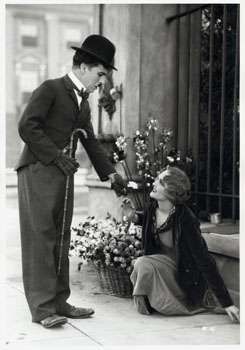
The scholarship above is not disinterested history. It is the production office of The Queen's Fare learning its own grammar before writing its first scene.
The Queen's Fare is a short-form wordless narrative series released in increments of six to twelve seconds. Its subject is a queen-spirit and five dragon guardians. Its production medium is visual — sequential images without dialogue, delivered at a rhythm closer to silent film's brief internal moments than to the extended wordless acts of WALL-E or Fury Road. But the grammar that makes a six-second sequence comprehensible and emotionally complete is the same grammar that makes a thirty-five-minute wordless act work. The scale is different; the mechanism is identical.
What this essay establishes, as a working framework for the production:
Performance register matters at every scale. The queen-spirit's gesture vocabulary must be calibrated to how close the audience is to her face. At a distance, gesture can be large. In close-up, restraint carries more. Lois Weber understood this in 1913; the Pixar animation team rediscovered it in 2006 preparing WALL-E. The principle is not historical: it is structural.
Meaning lives in the cut. No individual frame in The Queen's Fare will carry its meaning in isolation. The emotion exists between the queen's face and the dragon's action, between the action and its consequence, between the consequence and the queen's response. Kuleshov proved this in 1921. Every sequence has to be built in the editing rhythm, not assembled from adequate individual shots.
Tonal color is a grammar. Every chromatic choice — whether the queen appears in warm amber or cold blue or the hard red of conflict — is not aesthetic preference. It is a statement about what kind of scene the viewer is entering. The silent-film color conventions are available, legible, and not accidentally developed: they survived the transition to sound because they are cognitively efficient. Use them deliberately.
Transitions are punctuation. Each six-to-twelve-second increment needs to close clearly and open the next invitation clearly. The iris-out is not a retro stylistic choice; it is the most efficient visual full stop cinema has developed. The choice of how each increment ends will determine whether the audience experiences the series as a continuous narrative or as isolated fragments.
Trust the viewer. This is the deepest lesson of the Kuleshov Effect, and it is the one most likely to be undermined by anxiety about what the audience might miss. When Charlie Chaplin made City Lights in 1931 — three years after The Jazz Singer had commercially ended the silent era — he made a deliberate choice to trust the visual grammar entirely, refusing the available crutch of dialogue for a film that climaxes in a single silent close-up of the Blind Girl recognizing the Tramp. That close-up has no dialogue because it needs none. The grammar carries it. The viewer supplies the feeling, which is why it remains one of the most devastating single moments in the history of cinema.
JADA — a 65-foot classic yawl built in 1938 — has been making her passages on San Diego Bay for years in exactly this visual register: seen from the shore, seen from the water, her hull and rig readable to anyone with eyes, her story arriving in images before any words are possible. The Queen's Fare is learning to tell her story in the language she has always spoken.
References
Primary and secondary sources consulted for this article:
On silent film acting: Victoria Duckett, "Acting: The Silent Screen (1895–1927)," in Acting (Rutgers University Press, 2015). Vachel Lindsay, The Art of the Moving Picture (Macmillan, 1915). Marshall Neilan, trade-press statement, 1917 (quoted in multiple secondary sources including the Duckett essay). Lillian Gish, "First Lady of the Screen" designation: Vanity Fair, 1927.
On intertitles: Ben Model, "The Silent Film Universe, Chapter 11: Intertitles," silentfilmmusic.com. Silent Cinema Society, "Titles & Intertitles" resource pages. Wikipedia, "Intertitle," cross-referenced against primary film documentation.
On Suspense (1913): Library of Congress National Film Registry selection notice, 2020. Movies Silently, "Suspense (1913): A Silent Film Review." Wikipedia, "Suspense (1913 film)," cross-referenced against IMDb (tt0003424). Release date July 6, 1913, Rex Motion Picture Company, confirmed across multiple sources.
On D. W. Griffith and continuity editing: Tom Gunning, "D. W. Griffith and the Origins of American Narrative Film" (University of Illinois Press, 1991). Britannica, "D. W. Griffith: The Birth of a Nation and Intolerance." San Francisco Silent Film Festival, "Intolerance" notes. The figure of 50+ transitional edits in Intolerance is derived from secondary analysis of the film's construction.
On the Kuleshov Effect: Wikipedia, "Kuleshov effect," with citation to Lev Kuleshov, Art of the Cinema (1929, published in English translation 1974). Vsevolod Pudovkin's description of the Mosjoukine experiment, quoted in multiple secondary sources. Experiments dated to 1921 per consensus of film history scholarship. Fiveable, "Kuleshov Effect: Film History and Form."
On transitions (iris, wipe, dissolve): StudioBinder, "Types of Editing Transitions in Film." HowToFilmSchool.com, "Iris Shot / Iris In / Iris Out." NumberAnalytics, "The Art of Wipe in Cinematography." D. W. Griffith's use of iris-outs in Intolerance verified against the San Francisco Silent Film Festival notes.
On silent film tinting and toning: Film tinting entry, Wikipedia, cross-referenced against the George Eastman Museum's film101 series on silent cinema color. San Francisco Silent Film Festival, "The Color of Silents." Bioscope, "Colourful stories no. 12: Tinting and toning." The 74% figure derives from a study of 1908–1912 fragments summarized in the George Eastman Museum source.
On WALL-E (2008): Vice, "The First 35 Mins of 'Wall-E' Is Still the Best Thing Pixar Has Ever Done." NPR, "'Wall-E,' Speaking Volumes with Stillness and Stars," June 27, 2008. Andrew Stanton, Criterion Collection interview, via The Wrap. Pixar animators' use of silent film study confirmed in multiple production interviews.
On A Quiet Place (2018): Screenwriter Bryan Woods and Scott Beck, SXSW 2018 presentation, reported in Filmmaker Magazine. AI in Screen Trade, "The Power of Silence: Using Minimal Dialogue in 'A Quiet Place'," October 2018. Dialogue count (65 lines, 8 from recorded song) cited in multiple film analysis sources.
On Mad Max: Fury Road (2015): Screen Rant, "Why The Original Mad Max & Fury Road Have Almost No Dialogue." IMDb Trivia, tt1392190. Tom Hardy's dialogue count (52 lines including voice-over) and Charlize Theron's (80 lines for Furiosa) per IMDb News. George Miller's stated intention of making "a silent movie with sound" and his study of Harold Lloyd and Buster Keaton confirmed across multiple production interviews.
On Metropolis (1927): Fritz Lang and Thea von Harbou, Metropolis (UFA, 1927). Final intertitle ("The Mediator Between the Head and the Hands Must Be the Heart") verified against the film. Art direction credited to Otto Hunte, Erich Kettelhut, and Karl Vollbrecht; influence of Bauhaus, Cubism, and Futurism documented in Artland Magazine, "Art Influences in Fritz Lang's Metropolis."
A note on the images. All photographs in this article are in the public domain in the United States and have been sourced from Wikimedia Commons. The Great Train Robbery (1903): public domain, published before January 1, 1931. The Birth of a Nation (1915): public domain, published before January 1, 1931. Lev Kuleshov in Za Schastem (1917): public domain, published before January 1, 1931. Metropolis set photograph (1927): public domain in the U.S. and country of origin; photographer Horst von Harbou died 1953. City Lights publicity still (1931): public domain in the United States; published 1931 without copyright notice, no renewal of record. All images reproduced for purposes of historical commentary and scholarship.